For basic file upload you can use the TextField component.
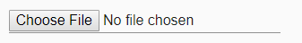
The code will looks something like this.
<TextField
  name="upload-photo"
  type="file"
/>
The important thing to note here is you need to set the type props to file
How do you customize it?
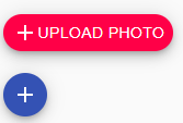
As the basic controls are not that fancy we may need to customize it. Since we are using Material UI its straight forward.
Step 1
Create an html input with id and file properties. Use style='display:none' as we don’t want to show it.
The code will look like this
 <input  style={{ display: 'none' }}
         id="upload-photo"
         name="upload-photo"
         type="file"/>
Step 2 : Customize it
Create a label around the input which we created in step 1
Add Material UI Button or Fab based on how you want your file upload to look.
Lets try with Button first.

Inside the label which we created add a Button component. Add the props component with value span. This is very important otherwise the button component will render using the html <button> tag, which fails our file upload.
For Button component the code will look like this. (working example at the end of post)
<label htmlFor="upload-photo">
  <input
    style={{ display: 'none' }}
    id="upload-photo"
    name="upload-photo"
    type="file"
  />

  <Button color="secondary" variant="contained" component="span">
    Upload button
  </Button>
</label>;
Now lets try a different UI

We will use Material UI Fab component for this. The code is very similar to what we have in button example.
<label htmlFor="upload-photo">
  <input
    style={{ display: 'none' }}
    id="upload-photo"
    name="upload-photo"
    type="file"
  />

  <Fab
    color="secondary"
    size="small"
    component="span"
    aria-label="add"
    variant="extended"
  >
    <AddIcon /> Upload photo
  </Fab>
  <br />
  <br />

  <Fab color="primary" size="small" component="span" aria-label="add">
    <AddIcon />
  </Fab>
</label>;
Hope this helps. Happy coding 🍺

One Comment
Huy
Thanks, that’s helpful 🙂